
CandleGraph Pro
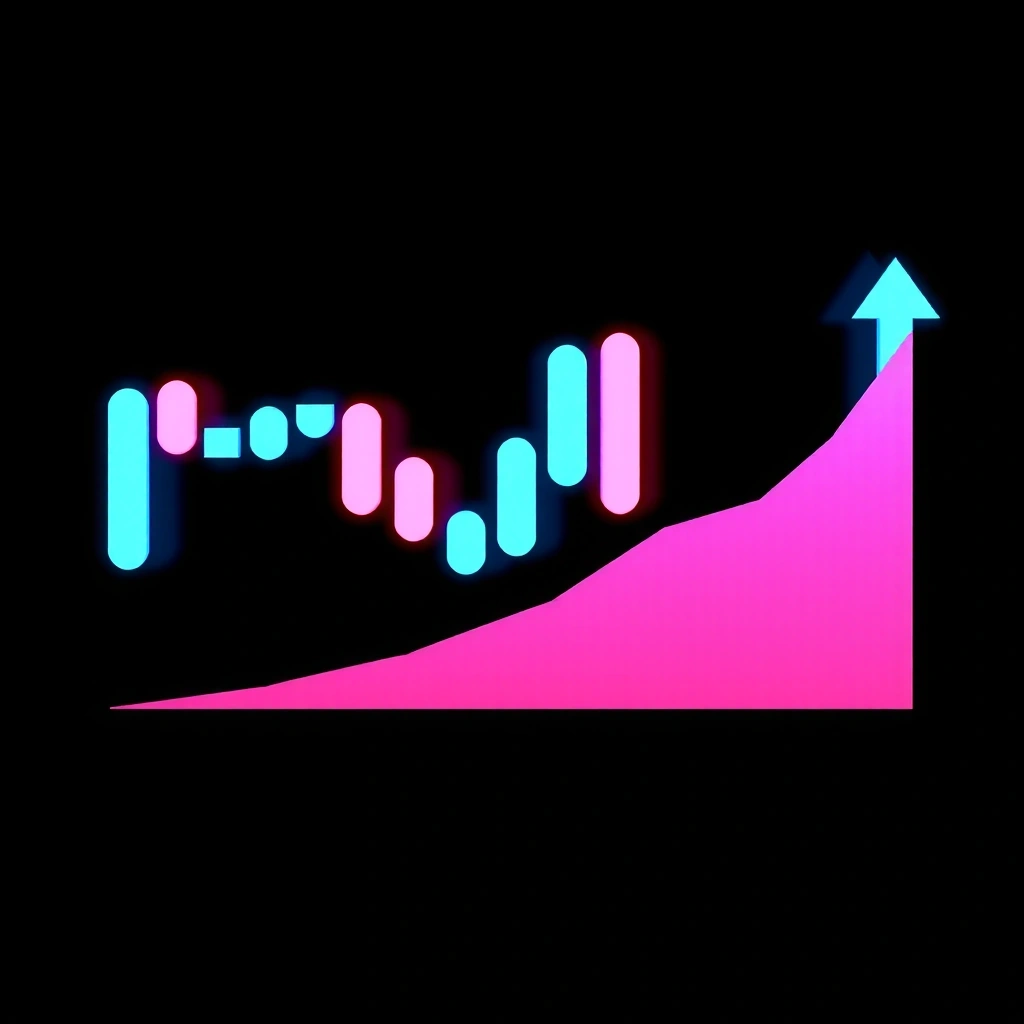
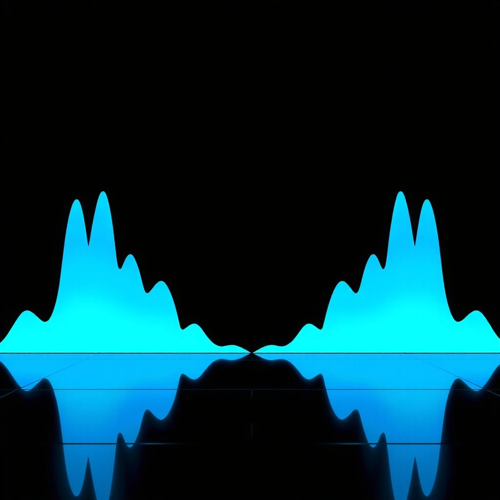
A minimalist rendering of market volatility. We focus on the interplay of negative space and piercing color accents to simulate price action without the noise.
- Zero-latency visual feedback
- Customizable grid overlays
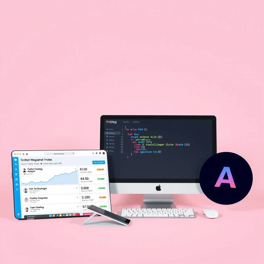
Explore the core mechanics behind our tools. Each product is a study in visual fidelity—no live data, pure aesthetic precision designed for the modern strategist.
A minimalist rendering of market volatility. We focus on the interplay of negative space and piercing color accents to simulate price action without the noise.

Simulating a level progression system where each node represents a decision point. The sharp contrast highlights the pathfinding logic inherent in game design.
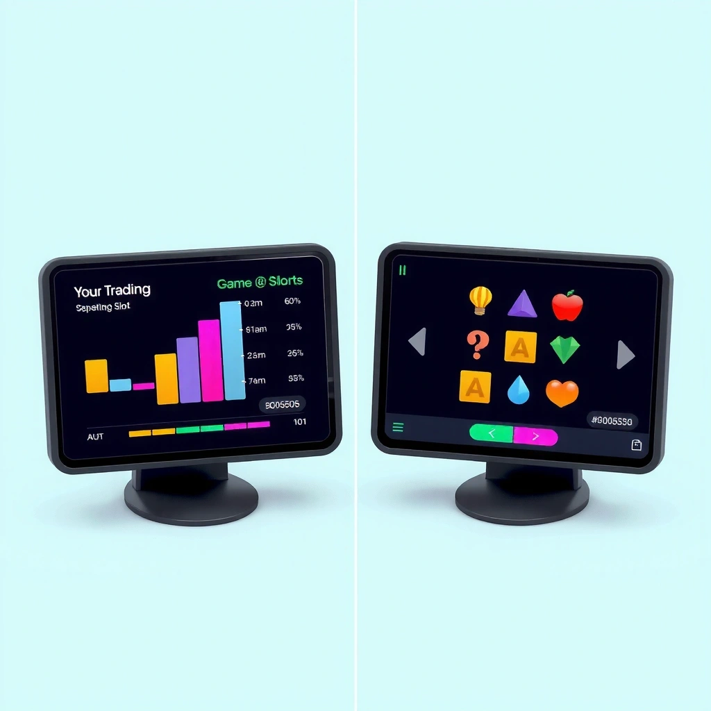
Our signature dual-format tool. It merges the analytical spacing of financial dashboards with the modular inventory systems found in RPG mechanics.
A study in motion (simulated). We analyze how scrolling elements capture attention in peripheral vision, a key mechanic in both trading and gaming.
A component library for overlay interfaces. Inspired by tactical HUDs, it prioritizes clarity and rapid information scanning over decorative elements.
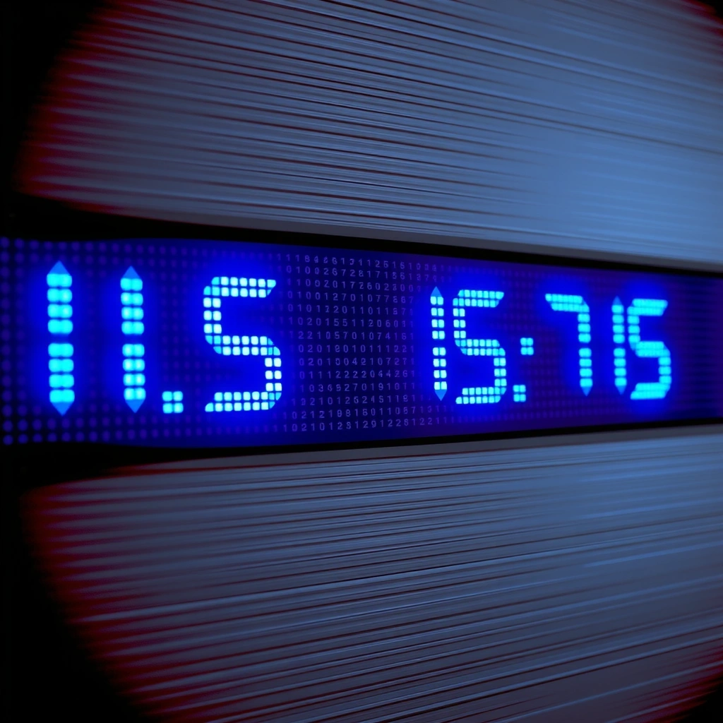
Translating sound design principles into visual feedback. Used in rhythm games and alert systems, focusing on amplitude and frequency representation.
Interested in the methodology behind these visuals?
Visit the StudioToggle between our dual design philosophies. Use the control to switch the visual simulation on the right.
Our tools are built on "Futuristic Budget-Conscious Minimalism." We strip away UI noise to focus on the signal—whether it's price action or game state.
Visual representation only. No live data feed.
A practical breakdown of visual strategy in high-density interfaces. This guide applies to both financial dashboards and game HUDs, where clarity determines success.
In high-stakes environments, the visual weight of information is critical. "Noise" is any element that consumes cognitive load without providing immediate value. "Signal" is the data that drives decision-making. Pridleg tools are designed to maximize signal by minimizing noise through strict color discipline and geometric spacing.
Can a user identify the trend in under 0.5 seconds?
Does clutter increase the chance of misreading a value?
Does the layout cause eye strain over extended periods?
Does the visual hierarchy hold up on smaller screens?
Our methodology follows a strict sequence to ensure that the final visual output matches the intended data logic without ambiguity.
Identify the data type. Is it continuous (price) or discrete (grid items)? This dictates the geometry.
Choose the contrast set. Electric Blue for information, Hot Pink for alerts/primary actions.
Map data to visual primitives. Bars, lines, nodes. Ensure alignment to the baseline grid.
Test for fatigue. Does the layout hold up after 5 minutes of viewing? Remove non-essentials.
SIMULATION_ACTIVE // 0x4F2A
Great interfaces feel inevitable, as if they were discovered rather than designed. At Pridleg, we strip away the decoration to reveal the underlying structure of the interaction. Whether it's a candlestick chart or a game level grid, the math is the same. We simply render the truth of the system.
Real-world metrics from our design simulations.
Our visual tools maintain structural integrity across all resolutions. Benchmarked against 4k displays.
CSS-based rendering ensures the browser paints frames instantly, preventing visual tearing in charts.
All visuals are native HTML/CSS. No WebGL, no heavy libraries. Just code.
"We needed a dashboard visual that wouldn't distract from the actual trading data. The Pridleg mockups provided the perfect 'skeleton' for our frontend dev team."
Ready to build your visual toolkit?
© 2026 Pridleg. Oxford Street 238, Glasgow. Mon-Fri: 9:00-18:00.